Siddharth
Asawa

Expertise
UX Designer & Researcher
Tools
Team
5 members
Duration
Sep'20 - Dec'20 (14 weeks)
Intro
Monterey Bay Aquarium revamped their website in March 2020. Since then they were starting to see some potential pain point on some pages and also with donations.
My Role
I analyzed google analytics data
I also Facilitated user testing, tree testing
Designed hi-fidelity prototype
Created pitch deck with director of design
High-fidelity Prototype satisfying the goals to increase user engagement on Live Cam, strategy to drive donation and improve the overall experience of the website with strong evidence.
Outcome
Problem
Major Usability issues affecting user engagement & donation
-
Deeper content not easily discoverable.
-
User journey of donation not effective.
-
Lacking microcopy and improper mental model of Live Cam page.
Impact
Increased user engagement by 35% and user donation by 21%
-
Maximized user engagement with the content on Live Cam Pages.
-
Made deeper content more discoverable through effective navigation.
-
Increased user engagement and drive donations from popular areas of the site like Live Cams.
Gaining Empathy
Road to the Project Goals
The best to solve the problem is to understand what the target audience feels or needs. And logical way to gain the empathy is to put yourself into their shoes. So in the whole project I along with my other stakeholders tried to adopt this logic and that really helped us to reach our goals.
Design & Iterate
Uncover
Understand
Identify user needs and pain points related to Live Cams and Donation Process
Reveal findings
from Google Analytics
and Tree Testing
Conduct usability tests and deliver high fidelity mocks


Get a Glance
Features

Live Cam Quick Navigation
-
As one of the important feature, It would make much more sense to add Live Cams on quick navigation panel in order to provide another path to visit the page that is easily discoverable and quickly accessed.
Call to Action Donation Prompt
-
Call to action for donations right next to the live cams to drive more donations.
-
Changing the amounts to less intimidating amounts to promote donations from digital visitors.


Post Donation Experience
-
In order to add Emotional Experience for users, to have "more to explore" where they can find the rewarding contents and also can print and email the receipt.
Live Cam Grid
-
To make it easier to switch between live cams to look into different animals and there’s less scrolling.
-
Also to navigation process easy, reducing the two click process to one click.

Building the path
Process
This was a three month project with New York Cares to improve the user experience for the Live Cam, making deeper content discoverable and enhancing Donation process to drive donation.

Client Meeting & Project Plan
Understand the organization and goals
Defining Audience
Understand demographics through analytics and building persona
Tree Test & Google Analytics
Understand user behaviors in navigation level and with analytical data
Minimum Viable Product
Implement with insights and assumptions
Testing, Analyzing & Iterating
Gather qualitative feedback, synthesizing and with quantitative data improvising it
Who are our real users?
Defining Audience
After analyzing the MBA website's Google Analytics data, we were able to gather important and resourceful insights and findings covering user demographics.
The data is from March 1st - October 1st that is basically from when they launched the renewed website.
Top insights and findings on user demographics are as follows,
Age and Gender
-
Almost 40% of users falls under the age category of 34 or below.
-
Female users(65%) are significantly more than male users(35%)


Device and City
-
There were more desktop(49%) users than mobile(33%)
-
Female users(65%) are significantly more than male users(35%)


Revenue behavior
-
Most Transaction comes from young group (25-34)
-
Senior group donate more money than any other group

Empathizing with User
Persona
After analyzing and gather insights, we created persona for each user groups. We aimed at understanding the typical background of each persona, their frustrations, and their goals.

Participants
-
18 Participants
-
Unmoderated Test
-
6 Tasks
-
14 students, 4 working professional
-
20-26 age range
Evaluating User Navigation
Tree Testing
As a part of our objective, effective main navigation is necessary for users to discover deeper content. We used Optimal Workshop to perform the test. Results from the Tree Testing are as follows
50%
users were unable to find "Live cam" feature on their first click
80%
of the participants failed
when asked to find "Match your Gift" feature
40%
found it difficult to discover when asked to find more description about Sea animals
Understanding Behaviors
Findings
After analyzing the MBA website's Google Analytics data, we were able to gather important and resourceful insights and findings to uncover user behaviors. The data is from March 1st - Sept 30th, 2020 that is basically from when they launched the renewed website. Overlapping Tree Testing findings were also taken into consideration to uncover findings and insights. Findings are unfolded according to the page categories.
1. Live Cams
2. Donation
Live Cams
Finding #1 - Live Cams Are Very Popular But Not Easily Discoverable
“Live Cams” page has the most user engagement out of all 4052 pages.
-
Almost 58% of users visited live cams page from March ‘20 - Sept ‘20.
-
Also it has lower amount of bounce rate (31%) that shows people finds the content useful.

-
But “Live Cams” are relatively hidden in the Animal section and only a minority of participants go to to find the “Live Cams” page directly.
-
Only 50% participants go to Live Cams by first clicking “Animals” section.

Finding #2 - Users likes to jump between Live Cam pages but not to explore deeper content like stories
When analyzing the event flow, Most of the traffic was between Live Cam pages.


Donation
Finding #3 - High Drop off Rates on Donation Page
When analyzing the event flow of donation page it was found out,
-
Out of 4.8k sessions, there were 3.6k drop-offs which was around around 75% of the total.

Finding #4 - Young group donates less but has higher number of transaction
Most Transaction comes from young group (25-34) which was around 1,027 but didn't generate($147k) as much as 65+ age group did ($206k). Whereas 65+ had only 782 transaction.

Refining website
Building Prototype
After uncovering findings, we as a team scheduled meeting and came up with recommendation to solve user pain points and tried to built prototype on recommendation.
Live Cams
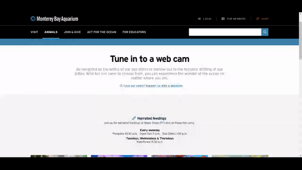
Recommendation #1 - Add live cams to the quick navigation panel
As one of the important feature, It would make much more sense to add Live Cams on quick navigation panel in order to provide another path to visit the page that is easily discoverable and quickly accessed.

Before

After
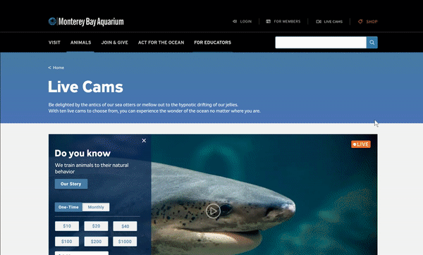
Recommendation #2 - Improve overall user experience on Live Cam pages by putting everything on same page
-
Add the link for the deeper content like stories on the prompt and on the page to make it more discoverable and accessible.
-
Provide the users with all the information about a particular animal on the same page
Before
After
Donation
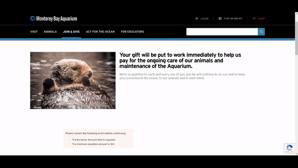
Recommendation #3 - Simplify the donation process
-
Simplify the donation process and change it from two-step to one-step experience by reducing number of clicks.
-
Try to provide form so users can fill all the information at once to make the process effective and fast.
-
-
Combined with previous findings, we add portals to deeper content on the confirmation page to increase the accessibility and enhance the connection.
Before
After
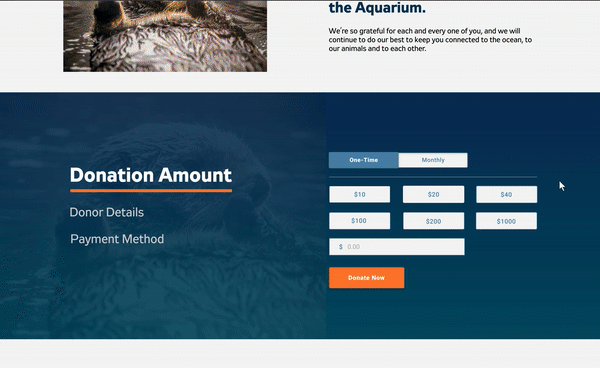
Recommendation #4 - Add Call to action on Live Cam and Change predetermined amount to lower value
-
Add a call to action for donations right next to the live cams to drive more donations.
-
Change the amounts to less intimidating amounts to promote donations from digital visitors.


Before
After
Evaluating Prototype
User Testing
Positives
-
Users really like quick navigation and found it easy to discover.
-
Users found it much easier to switch between live cams to look into different animals since there's less scrolling
Need Improvement
-
Users need some indicator to discover deeper content on Live Cam pages
-
Improve post donation page to make donors feel special
About Testing
-
9 Participants
-
6 in 18-34 age group
-
3 in 55+ age group
-
-
Moderated Remote Test
-
4 Tasks
-
Same tasks on two prototypes:
-
1) Current website
-
2) Our recommendation
-
-
Tools: Zoom, Figma
-
After test: post-test questionnaire
Final Stage
Client Presentation
Finally, making improvement from the user testing insights and giving the final touch we were able to deliver the final version prototype through presentation. Clients were really happy with the insights and were also surprise findings that they were not aware of. Overall we were able to drop-ship the product by living up to their expectations. Links for Final Prototype and presentation are mentioned below

What I learnt
Takeaways
What I'm proud of
-
We managed to find design solutions that both satisfied our stakeholders and please users.
-
We explained relatively complex ideas in clear and accessible ways.
-
Design is changing and evolving, so does business, but we adapted it pretty well in bringing alive business goals and values through design.
-
I was able to make clear and interactive prototype that satisfied our design goals and also making life easy for users overall and also during user testing.
What I wish could have done better
-
I wish we could have tested with users more often and earlier in the design cycle, especially after initial concept generation. This would allow us to validate and develop ideas in a more timely fashion.
-
We had more ideas to implement on but due to less time and time difference issues wasn't able to reflect it on the prototype. But If I could have started it little bit earlier perhaps we could have tested the idea and could have seen if it was working or not.
You may also like

UX Researcher
Mural Routes is the only non-profit in Canada promoting murals & wall art

Visual Communication & Interaction Designer